Widget
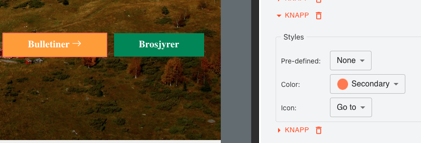
Button
Button in variant form, eg. primary, light, link.
Note: it's a good practise to give proper style options in a project, eg. type: primary, outline, light, link, rounded: none / rounded, size: none / small / large,
Style development
Below are style keys where developer can use to create widget style. For more please read documentation.
| Key | Description | class example |
| root | Root | root: 'mt-1' |
| button | The button element | button: 'bg-neutral-100 border' |
| before-icon | Icon before text | 'before-icon':'icon icon-success' |
| after-icon | Icon after text | 'after-icon':'icon icon-more' |
Developer
Name: DM Editor
Website: https://dmeditor.io
Package
Built in

