Widgets
Widgets are functions
Form & Form field
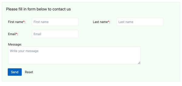
Form and Form field together create simple forms. Any widget can be insert between Form and Form field, eg. layouts, text, image.
Input types supported in Form field: text input, text area, checkbox, select, radio, file.
Available after 0.2.2.
Pop up
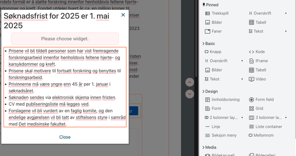
Pop up is a widget for pop up dialog.
The interesting part is that editor can edit dialog content in the same way as normal content - in pop up area (see screenshot).
Pop up is avaiable after 0.2.1
Space
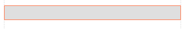
Space can be used as "empty element" with height when margin can not apply - eg. space with background, or last element - since DM Editor doesn't support margin bottom (which is on purpose).
Hero text
Hero text is hero image + text.
Settings:
- Image: full width?
- Image position: left / right
Note: difference between Hero text with 2 columns layout: Hero text alway has hero on top in mobile view.
Gallery
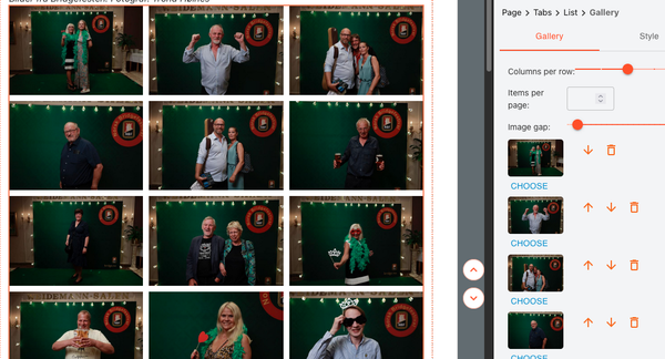
Image gallery with click to popup & browse.
Settings:
- Gallery gap in pixel
- How many item per row
- Pagination items
Line
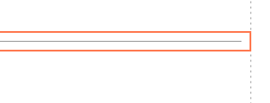
Horizontal line.
Sometimes it's better to use Line instead of border since the line can set pading, margin, width, etc.
Grid
Grid to show similar items. Can set columns and gap.
Note: if your content items are not similar and is in fixed columns, use layouts (eg. 2 columns / 3 columns).
List
Rendering children vertically or horizontally.
Settings:
- direction: vertical / horizontal
List also can be used as "container", eg. block has width and parent needs background with full screen width.
Button
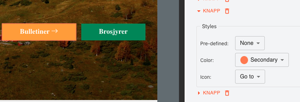
Button in variant form, eg. primary, light, link.
Note: it's a good practise to give proper style options in a project, eg. type: primary, outline, light, link, rounded: none / rounded, size: none / small / large,
Table
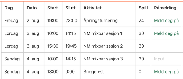
Table, default settings
- border: none / row / cell
- border color
- cell padding
- text color
- odd row background
Can set bold / italic / link on cell text.
Text
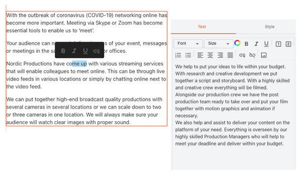
Rich text, with tools:
- bold
- italic
- underline
- color
- bulletin
- align: left, center, right
- link
- image
Note: Text can be used in where plain text is needed. It supports soft break, simple format & color, and won't have margin if it's one pharagraph.
Heading
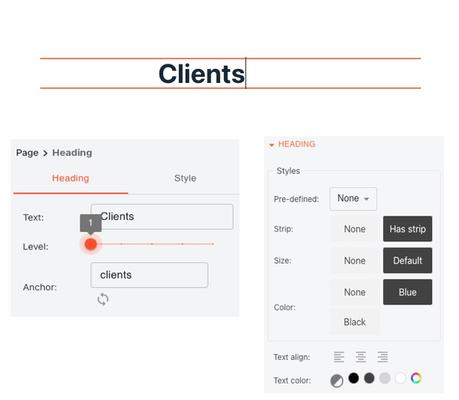
Equivalent to html heading h1, h2, h3, h4, h5.
Customized style can create fancy looking, eg. page title.
Want to list your widget? Click here

